Map of the Month

These custom-crafted maps are developed by ABAG and MTC’s mapmakers who turn data into art to tell compelling stories about important trends in the Bay Area, across the nation and around the world.

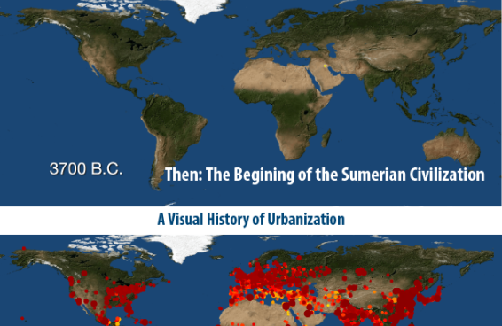
A visual history of urbanization
July, 2016

History Of Urbanization:

How were cities distributed globally in the past? How many people lived in these cities? How did cities influence their local and regional environments? This month's map seeks to answer these...

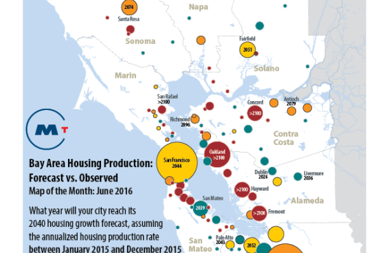
Map of Bay Area Housing Production
June, 2016

Bay Area Housing Production:

This map depicts housing production performance for Bay Area jurisdictions between January 2010 and December 2015, and housing production over the past year. Key conclusions are summarized below:...

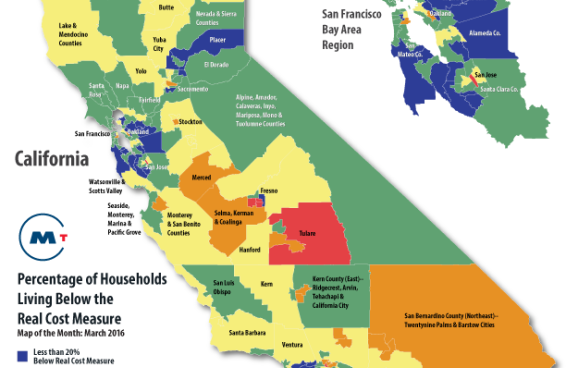
Map of CA percentage of households living below the real cost measure
March, 2016

Struggling To Get By:

This map depicts the real costs of living in California's communities, as defined by a recent report released by the United Way of California titled: Struggling to Get By. Key findings in this report...

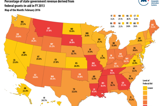
US Map of states that rely on the most federal aid.
February, 2016

Which States Rely The Most On Federal Aid?

This map of the month answers the question: Which states rely the most on federal aid? The map depicts all federal governmental transfers to the states, not just transportation funding. For the...

maps demonstrating where deaths from guns and motor vehicles converge in time.
January, 2016

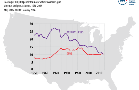
Deaths From Motor Vehicles And Guns Converge

For the first time ever, firearms and motor vehicles are killing Americans at an identical rate, according to an analysis of CDC data by the Violence Prevention Project at UC Davis. The convergence...

Historical fixed rate market and BATA financing
December, 2015

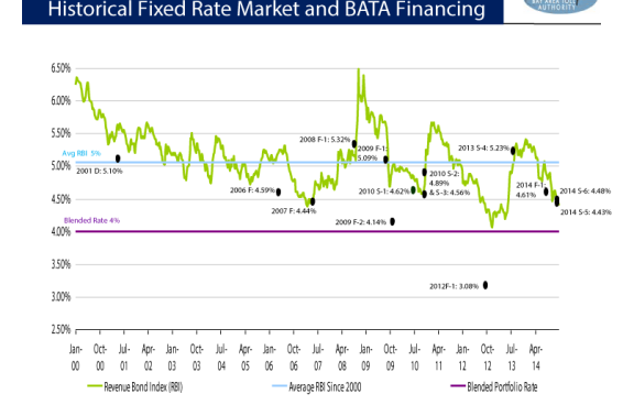
Historical Fixed-Rate Market And Bata Financing

This chart compares the historical fixed rate Revenue Bond Index (RBI) to the actual results of BATA's financings since 2000. As you can see, the average RBI over that time period is a little over 5%...