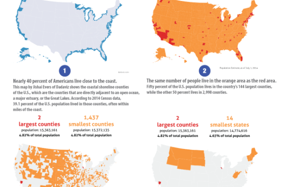
Map of the Month

These custom-crafted maps are developed by ABAG and MTC’s mapmakers who turn data into art to tell compelling stories about important trends in the Bay Area, across the nation and around the world.

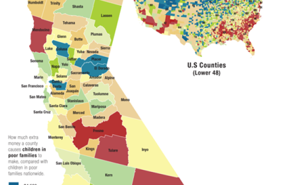
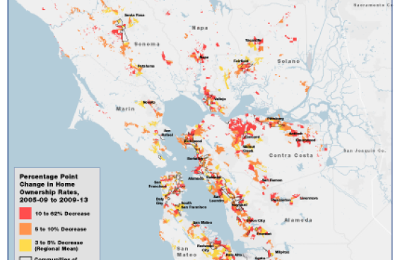
map of best and worst places growth
May, 2015

The Best And Worst Places To Grow Up

Children who grow up in some places go on to earn much more than they would if they grew up elsewhere. Location matters enormously. If you're poor and live in the San Francisco area, it's better to be...

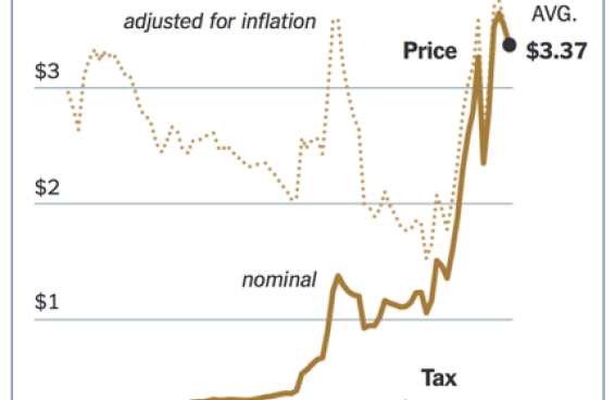
table describing price of gas vs. gas tax
January, 2015

Average Annual Price Of Gas Vs Gas Tax

This month's chart highlights the growing divide between the price of gas and the taxes imposed for its use. When gasoline topped $4 a gallon, opponents of an increase in the gas tax argued that...

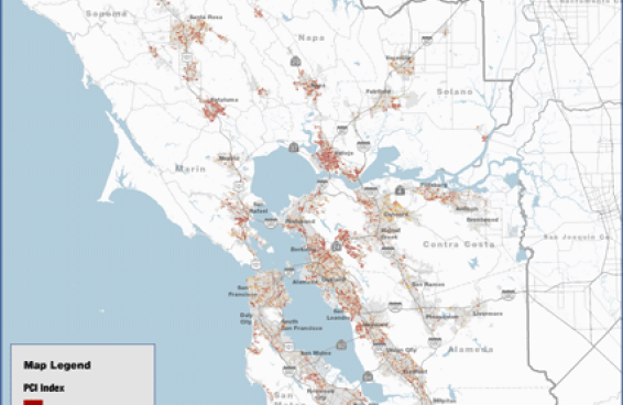
map of the bay area identifying pavement conditions in 2013
December, 2014

2013 Pavement Condition Index

This map visualizes the 2013 pavement condition for local streets within each jurisdiction in the San Francisco Bay Area, as retrieved from MTC's StreetSaver database. Pavement condition is...

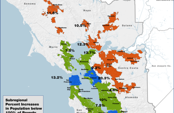
Map of Bay Area Suburbanization poverty 2000 to 2012
October, 2014

Bay Area Suburbanization Of Poverty, 2000 To 2012

This map shows, by county-based place types, the percentage change in the population living below 100% of the Federal poverty level. Place types were defined by grouping US Census Designated Places as...