Map of the Month

These custom-crafted maps are developed by ABAG and MTC’s mapmakers who turn data into art to tell compelling stories about important trends in the Bay Area, across the nation and around the world.

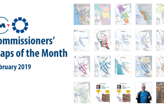
slide entitled Commissioners Maps of the Month
February, 2019

Commissioners' Map of the Month

February’s collection of 17 maps, when presented together, tells a story of why regional action matters. Ranging from a Rand McNally-style roadway map and a regional transit map to a commute flow...
bay-area-rent-increases-2011-2016
December, 2018

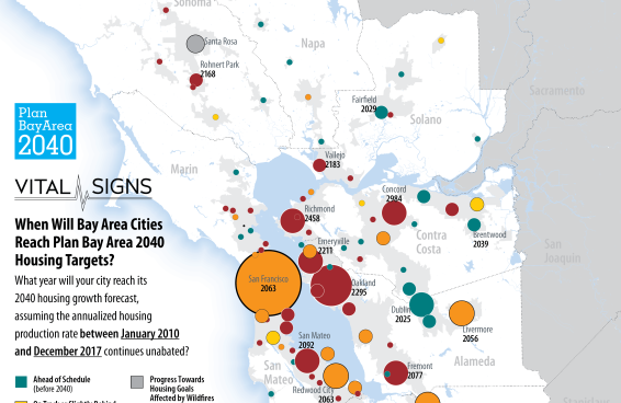
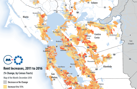
Bay Area Rent Increases 2011 to 2016

This map illustrates that, between 2011 and 2016, most places in the Bay Area experienced significant rent increases. Many communities saw rent increases of 40% or more in the five-year period. For...

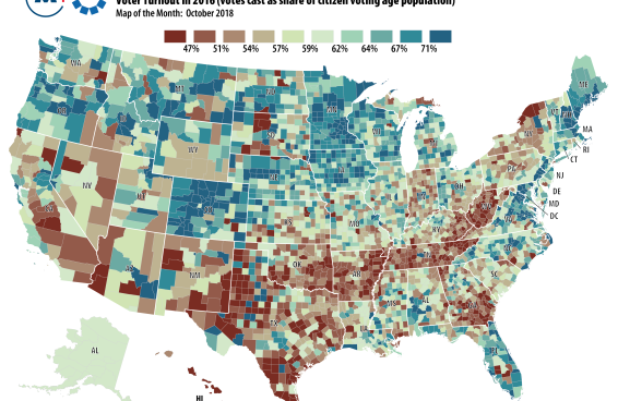
US Map of voter turnout in 2016
October, 2018

Where People Show Up to Vote – and Where They Don't

This month’s Map of the Month is a different take on red and blue America. In this new analysis by the Washington Post, the colors represent voter turnout levels by county for the 2016 presidential...

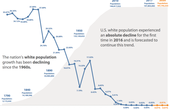
chart of US white population growth rate
July, 2018

U.S. White Population Growth Rate, 1790-2020

This month’s Map of the Month highlights an absolute decline in the nation’s white non-Hispanic population—accelerating a phenomenon that was not projected to occur until the next decade. America’s...

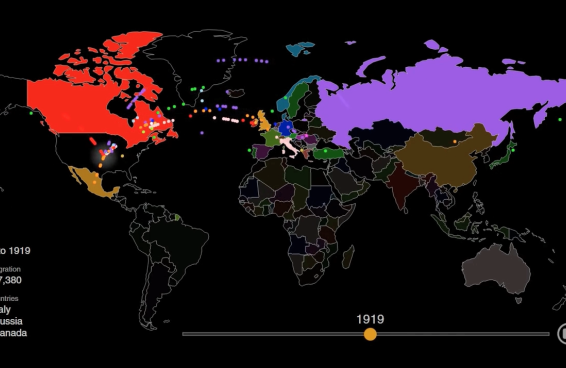
map of global migration from 1910 to 1919
June, 2018

U.S. Immigration, 1820-Present

From 1920 to 2013, 79 million people obtained lawful permanent resident status in the United States. This month’s Map of the Month visualizes all of them based on their prior country of residence. The...