

These custom-crafted maps are developed by ABAG and MTC’s mapmakers who turn data into art to tell compelling stories about important trends in the Bay Area, across the nation and around the world.
March, 2011
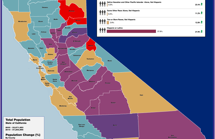
California Population Change 2000-2010
This map illustrates the percentage population change by county in the state of California between 2000 and 2010. The data is based on the recently released 2010 census data, and shows that all counties within the state registered a population increase except Plumas, Sierra and Alpine counties. Placer, Kern and Riverside counties experienced the largest population growth with more than a 25% increase over the past 10 years.