

These custom-crafted maps are developed by ABAG and MTC’s mapmakers who turn data into art to tell compelling stories about important trends in the Bay Area, across the nation and around the world.
May, 2011
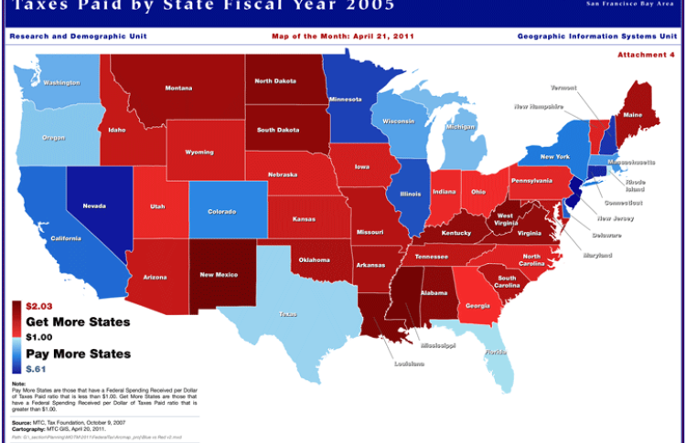
Federal Spending Received Per Dollar Of Taxes Paid By State Fy2005
The map of the month shows how federal funding is distributed throughout the country based on the amount of taxes paid by each state. By comparing the amount of taxes paid per state to the amount of federal spending received by each state, an index was created to show which states are benefitting more from federal spending, and which states are supporting them. "Get More States" have a Federal Spending Received per Dollar of Taxes Paid ratio of greater than $1.00, while "Pay More States" have a ratio of lower than $1.00.