

These custom-crafted maps are developed by ABAG and MTC’s mapmakers who turn data into art to tell compelling stories about important trends in the Bay Area, across the nation and around the world.
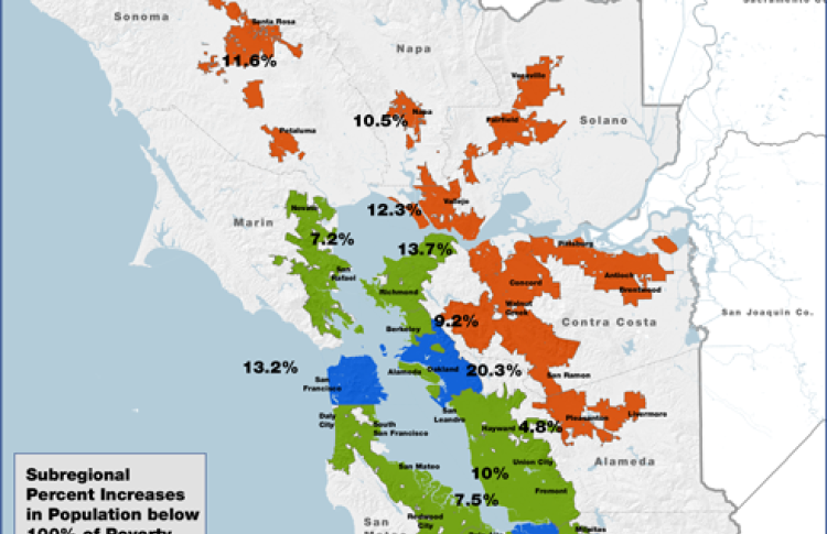
Bay Area Suburbanization Of Poverty, 2000 To 2012
This map shows, by county-based place types, the percentage change in the population living below 100% of the Federal poverty level. Place types were defined by grouping US Census Designated Places as Central Cities, Inner Suburbs, Outer Suburbs, and Balance of Counties, based on their population, employment and travel characteristics. Viewed regionally, the percentage increase in poverty was highest in the Outer Suburbs (62% regional average), as compared to the Central Cities (22% regional average) and Inner Suburbs (24% regional average) showing a pattern of larger increases in poverty in the Region's periphery. The percentage increases in poverty in the Outer Suburbs by County range from 38% to 89%, as compared to the Inner Suburbs which range from 17% to 30% and Central Cities from 3% to 40%.