These custom-crafted maps are developed by ABAG and MTC’s mapmakers who turn data into art to tell compelling stories about important trends in the Bay Area, across the nation and around the world.

2016 Presidential Election - Country Results
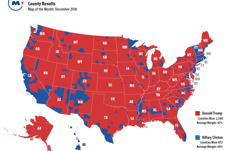
These maps provide three different views of the recent presidential election. The first map shows county-by-county results in the traditional red and blue colors. From a transportation perspective, one clear takeaway is that you could drive coast-to-coast without ever setting foot in a Clinton County. The second map comes courtesy of the Brookings Institution, and it tells a dramatically different story. While Secretary Clinton carried 2,000 fewer counties than Mr. Trump, her blue counties represent nearly two-thirds of the nation's Gross Domestic Product (GDP). Finally, the third map introduces some nuance to the stark contrast of the two other pictures. It depicts county-by-county results like the first map, but shows the margin of victory in a range of red and blue colors. The most striking thing to me about the third map is how many purple counties there are, where the vote margin was +/-10% for either Trump or Clinton. In other words, our closely divided county once again proved just how closely divided it is. My Christmas wish: that we can start emphasizing the close part more than the divided one.

