These custom-crafted maps are developed by ABAG and MTC’s mapmakers who turn data into art to tell compelling stories about important trends in the Bay Area, across the nation and around the world.

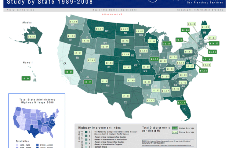
U.S. Highway Performance Study By State 1989-2008
This map illustrates highway improvement performance by state from 1989-2008. A performance index has been prepared to highlight the total number of categories in which each state showed improvement. The darker the shade of green, the more categories of improvement. The light and dark green labels show the total disbursements per mile ($M) per state.Most states (37 of 50) improved or maintained their performance in five or more categories. And most states (38 of 50) also spent less than the national average, per mile of responsibility. Interestingly, those states that spent the most money did not make the most improvement, and states with relatively few resources also made progress. For instance, California spent about twice as much as the average state (per mile of responsibility), but its performance improved in just two of the seven measures (deficient bridges and fatality rate). Hawaii and New York also spent between 2 and 2.5 times the national average but improved in just three of seven measures. Conversely, 10 states (led by North Dakota, Virginia and Missouri) spent less than the national average per mile of responsibility but improved on all seven measures, and only one state (Florida) improved on all seven measures and spent more than the national average.

