These custom-crafted maps are developed by ABAG and MTC’s mapmakers who turn data into art to tell compelling stories about important trends in the Bay Area, across the nation and around the world.

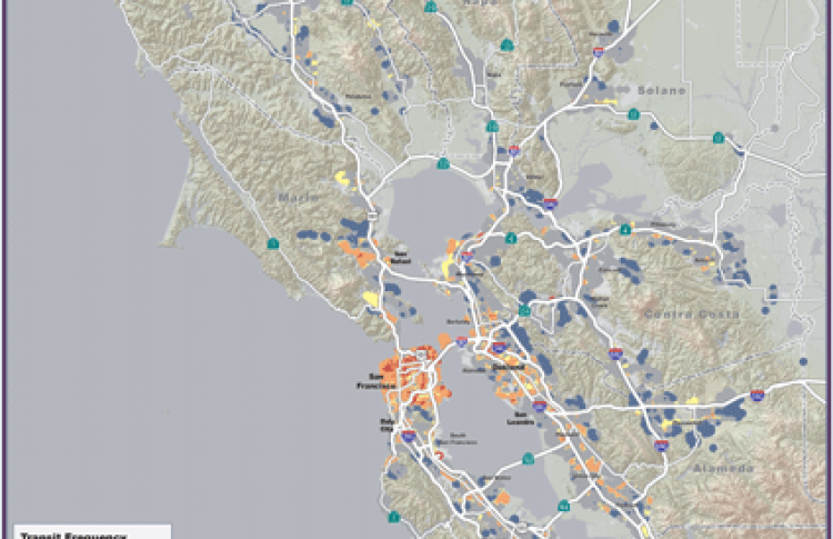
Transit Service Frequency
The map of the month shows the weekday transit service frequency within the Bay Area urban footprint. The transit service frequency was generated based on the rail, ferry and bus service data in MTC's regional transit database (RTD). Headway information for rail, ferry and bus routes was assigned to relevant transit stops and stations. These point data were then interpolated to the frequency of service displayed in the map. As you can see, the region's most frequent transit service is overwhelmingly concentrated in our three largest cities: San Jose, San Francisco, and Oakland.

