These custom-crafted maps are developed by ABAG and MTC’s mapmakers who turn data into art to tell compelling stories about important trends in the Bay Area, across the nation and around the world.

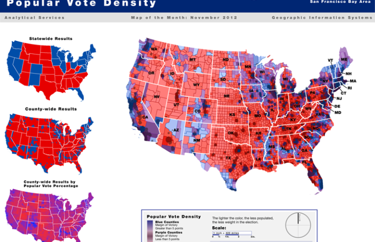
Popular Vote Density Map | 2012 Presidential Election Results By County
The Popular Vote Density Map attempts to convey a more nuanced view of the recent presidential contest than the ubiquitous red/blue state map. The typical statewide or county-wide red/blue map (shown at left) depicts presidential voting results on a winner-take-all basis, so they award an entire geographical area to the Republican or Democratic candidate no matter how close the actual vote tally The large map in the attachment factors in both the percentage of the popular vote won by each candidate as well as the population density of each county. So, the sparsely populated Great Plains and Rocky Mountain West are shown in a much lighter color than the Eastern Seaboard, and the map as a whole is more purple than either red or blue. Perhaps the United States is less divided than some maps would lead us to believe.

